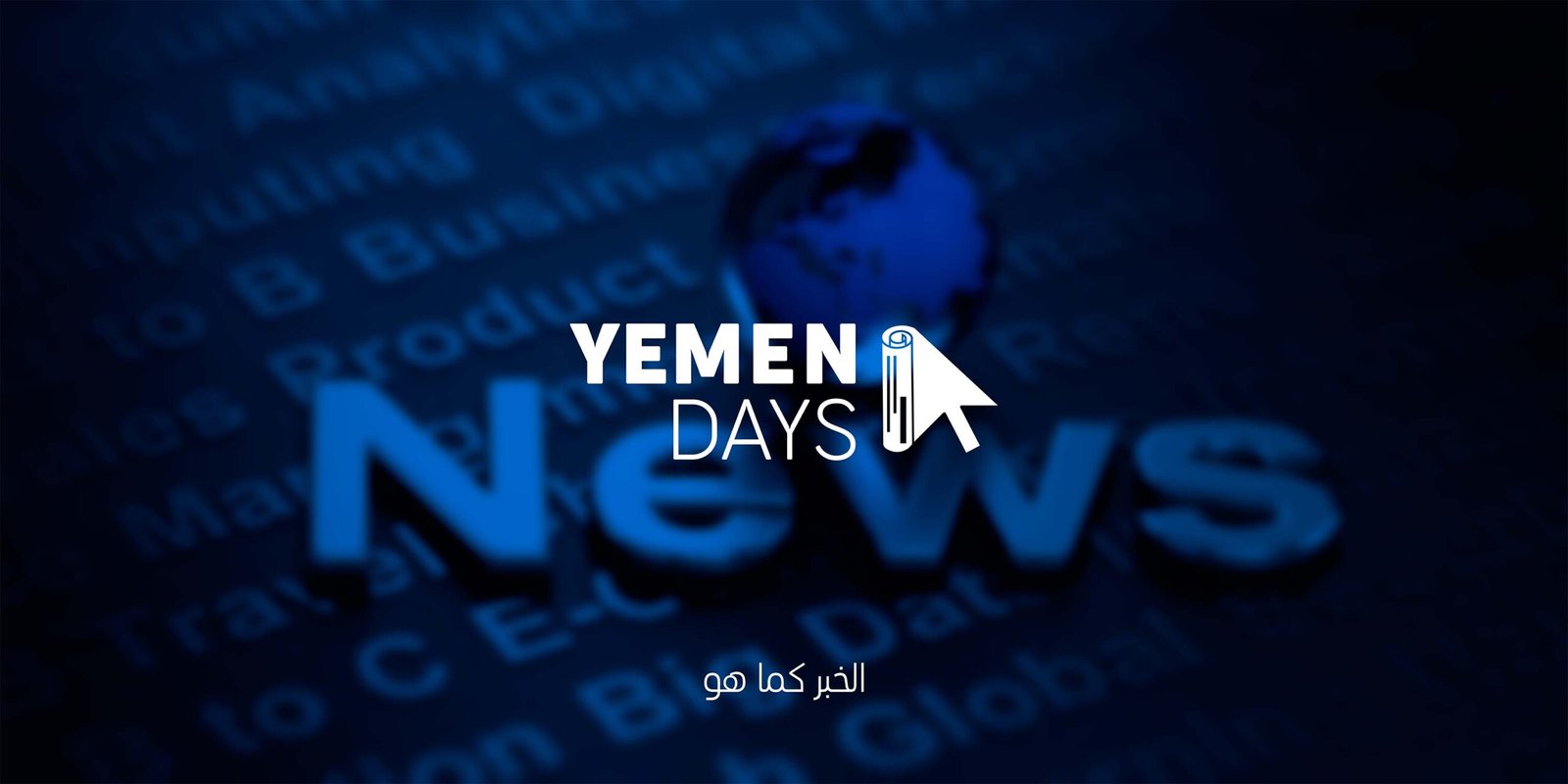
Yemen Days is a news platform delivering local and international news. The logo was designed to reflect trust, professionalism, and a modern appeal.
Logo Philosophy
The Yemen Days logo cleverly blends traditional journalism identity with modern digital presence:
Cursor Icon: Symbolizes digital access and instant news interaction.
Rolled Newspaper Icon: Represents credibility, authenticity, and classic journalism.
Typography: “YEMEN” in bold reflects a strong national identity, while “DAYS” in light font suggests daily renewal and continuous updates.
Slogan Philosophy
Slogan expresses the platform’s commitment to reporting news impartially and truthfully, without distortion or exaggeration. It reflects clarity and transparency and emphasizes presenting reality as it is, simply and professionally.
Typography
Cocogoose Pro is a powerful, modern font that features a variety of styles, including:
The font supports multiple widths (Condensed, Compressed, Narrow) and is available in multiple weights with italics, uppercase, and traditional numerals, as well as full support for Cyrillic and Greek alphabets. Its visual strength and high clarity make it ideal for titles and logos.
Color Philosophy
The golden yellow represents clarity, vitality, and editorial distinction, while the blue reflects professionalism, trust, and credibility. Together, they create a visual balance between warmth and reliability, reinforcing a strong and trustworthy media identity.